10 chart patterns every trader needs to know
Chart patterns are an integral aspect of technical analysis, but they require some getting used to before they can be used effectively. To help you get to grips with them, here are 10 chart patterns every trader needs to know.


A chart pattern is a shape within a price chart that helps to suggest what prices might do next, based on what they have done in the past. Chart patterns are the basis of technical analysis and require a trader to know exactly what they are looking at, as well as what they are looking for.
Best chart patterns
- Head and shoulders
- Double top
- Double bottom
- Rounding bottom
- Cup and handle
- Wedges
- Pennant or flags
- Ascending triangle
- Descending triangle
- Symmetrical triangle
There is no one ‘best’ chart pattern, because they are all used to highlight different trends in a huge variety of markets. Often, chart patterns are used in candlestick trading, which makes it slightly easier to see the previous opens and closes of the market.
Learn more about candlestick trading
Some patterns are more suited to a volatile market, while others are less so. Some patterns are best used in a bullish market, and others are best used when a market is bearish.
That being said, it is important to know the ‘best’ chart pattern for your particular market, as using the wrong one or not knowing which one to use may cause you to miss out on an opportunity to profit.
Before getting into the intricacies of different chart patterns, it is important that we briefly explain support and resistance levels. Support refers to the level at which an asset’s price stops falling and bounces back up. Resistance is where the price usually stops rising and dips back down.
The reason levels of support and resistance appear is because of the balance between buyers and sellers – or demand and supply. When there are more buyers than sellers in a market (or more demand than supply), the price tends to rise. When there are more sellers than buyers (more supply than demand), the price usually falls.
As an example, an asset’s price might be rising because demand is outstripping supply. However, the price will eventually reach the maximum that buyers are willing to pay, and demand will decrease at that price level. At this point, buyers might decide to close their positions.
This creates resistance, and the price starts to fall toward a level of support as supply begins to outstrip demand as more and more buyers close their positions. Once an asset’s price falls enough, buyers might buy back into the market because the price is now more acceptable – creating a level of support where supply and demand begin to equal out.
If the increased buying continues, it will drive the price back up towards a level of resistance as demand begins to increase relative to supply. Once a price breaks through a level of resistance, it may become a level of support.
Types of chart patterns
Chart patterns fall broadly into three categories: continuation patterns, reversal patterns and bilateral patterns.
- A continuation signals that an ongoing trend will continue
- Reversal chart patterns indicate that a trend may be about to change direction
- Bilateral chart patterns let traders know that the price could move either way – meaning the market is highly volatile
For all of these patterns, you can take a position with CFDs. This is because CFDs enable you to go short as well as long – meaning you can speculate on markets falling as well as rising. You may wish to go short during a bearish reversal or continuation, or long during a bullish reversal or continuation – whether you do so depends on the pattern and the market analysis that you have carried out.
The most important thing to remember when using chart patterns as part of your technical analysis, is that they are not a guarantee that a market will move in that predicted direction – they are merely an indication of what might happen to an asset’s price.
Head and shoulders
Head and shoulders is a chart pattern in which a large peak has a slightly smaller peak on either side of it. Traders look at head and shoulders patterns to predict a bullish-to-bearish reversal.
Typically, the first and third peak will be smaller than the second, but they will all fall back to the same level of support, otherwise known as the ‘neckline’. Once the third peak has fallen back to the level of support, it is likely that it will breakout into a bearish downtrend.

Double top
A double top is another pattern that traders use to highlight trend reversals. Typically, an asset’s price will experience a peak, before retracing back to a level of support. It will then climb up once more before reversing back more permanently against the prevailing trend.

Double bottom
A double bottom chart pattern indicates a period of selling, causing an asset’s price to drop below a level of support. It will then rise to a level of resistance, before dropping again. Finally, the trend will reverse and begin an upward motion as the market becomes more bullish.
A double bottom is a bullish reversal pattern, because it signifies the end of a downtrend and a shift towards an uptrend.

Rounding bottom
A rounding bottom chart pattern can signify a continuation or a reversal. For instance, during an uptrend an asset’s price may fall back slightly before rising once more. This would be a bullish continuation.
An example of a bullish reversal rounding bottom – shown below – would be if an asset’s price was in a downward trend and a rounding bottom formed before the trend reversed and entered a bullish uptrend.

Traders will seek to capitalise on this pattern by buying halfway around the bottom, at the low point, and capitalising on the continuation once it breaks above a level of resistance.
Cup and handle
The cup and handle pattern is a bullish continuation pattern that is used to show a period of bearish market sentiment before the overall trend finally continues in a bullish motion. The cup appears similar to a rounding bottom chart pattern, and the handle is similar to a wedge pattern – which is explained in the next section.
Following the rounding bottom, the price of an asset will likely enter a temporary retracement, which is known as the handle because this retracement is confined to two parallel lines on the price graph. The asset will eventually reverse out of the handle and continue with the overall bullish trend.

Wedges
Wedges form as an asset’s price movements tighten between two sloping trend lines. There are two types of wedge: rising and falling.
A rising wedge is represented by a trend line caught between two upwardly slanted lines of support and resistance. In this case the line of support is steeper than the resistance line. This pattern generally signals that an asset’s price will eventually decline more permanently – which is demonstrated when it breaks through the support level.

A falling wedge occurs between two downwardly sloping levels. In this case the line of resistance is steeper than the support. A falling wedge is usually indicative that an asset’s price will rise and break through the level of resistance, as shown in the example below.

Both rising and falling wedges are reversal patterns, with rising wedges representing a bearish market and falling wedges being more typical of a bullish market.
Pennant or flags
Pennant patterns, or flags, are created after an asset experiences a period of upward movement, followed by a consolidation. Generally, there will be a significant increase during the early stages of the trend, before it enters into a series of smaller upward and downward movements.
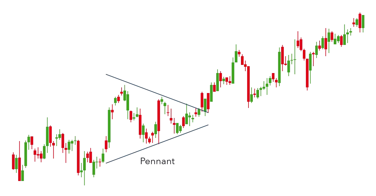
Pennants can be either bullish or bearish, and they can represent a continuation or a reversal. The above chart is an example of a bullish continuation. In this respect, pennants can be a form of bilateral pattern because they show either continuations or reversals.
While a pennant may seem similar to a wedge pattern or a triangle pattern – explained in the next sections – it is important to note that wedges are narrower than pennants or triangles. Also, wedges differ from pennants because a wedge is always ascending or descending, while a pennant is always horizontal.
Ascending triangle
The ascending triangle is a bullish continuation pattern which signifies the continuation of an uptrend. Ascending triangles can be drawn onto charts by placing a horizontal line along the swing highs – the resistance – and then drawing an ascending trend line along the swing lows – the support.

Ascending triangles often have two or more identical peak highs which allow for the horizontal line to be drawn. The trend line signifies the overall uptrend of the pattern, while the horizontal line indicates the historic level of resistance for that particular asset.
Descending triangle
In contrast, a descending triangle signifies a bearish continuation of a downtrend. Typically, a trader will enter a short position during a descending triangle – possibly with CFDs – in an attempt to profit from a falling market.

Descending triangles generally shift lower and break through the support because they are indicative of a market dominated by sellers, meaning that successively lower peaks are likely to be prevalent and unlikely to reverse.
Descending triangles can be identified from a horizontal line of support and a downward-sloping line of resistance. Eventually, the trend will break through the support and the downtrend will continue.
Symmetrical triangle
The symmetrical triangle pattern can be either bullish or bearish, depending on the market. In either case, it is normally a continuation pattern, which means the market will usually continue in the same direction as the overall trend once the pattern has formed.
Symmetrical triangles form when the price converges with a series of lower peaks and higher troughs. In the example below, the overall trend is bearish, but the symmetrical triangle shows us that there has been a brief period of upward reversals.

However, if there is no clear trend before the triangle pattern forms, the market could break out in either direction. This makes symmetrical triangles a bilateral pattern – meaning they are best used in volatile markets where there is no clear indication of which way an asset’s price might move. An example of a bilateral symmetrical triangle can be seen below.

Chart patterns summed up
All of the patterns explained in this article are useful technical indicators which can help you to understand how or why an asset’s price moved in a certain way – and which way it might move in the future. This is because chart patterns are capable of highlighting areas of support and resistance, which can help a trader decide whether they should open a long or short position; or whether they should close out their open positions in the event of a possible trend reversal.
This information has been prepared by IG, a trading name of IG Markets Ltd and IG Markets South Africa Limited. In addition to the disclaimer below, the material on this page does not contain a record of our trading prices, or an offer of, or solicitation for, a transaction in any financial instrument. IG accepts no responsibility for any use that may be made of these comments and for any consequences that result. No representation or warranty is given as to the accuracy or completeness of this information. Consequently any person acting on it does so entirely at their own risk. Any research provided does not have regard to the specific investment objectives, financial situation and needs of any specific person who may receive it. It has not been prepared in accordance with legal requirements designed to promote the independence of investment research and as such is considered to be a marketing communication. Although we are not specifically constrained from dealing ahead of our recommendations we do not seek to take advantage of them before they are provided to our clients. See full non-independent research disclaimer and quarterly summary.

Explore the markets with our free course
Discover the range of markets you can spread bet on - and learn how they work - with IG Academy's online course.