The basics of technical analysis
Types of charts
The first thing you'll need to understand as a technical analyst is the different types of charts at your disposal and their relative benefits.
Charts come in three main forms: line, bar and candlestick. Let's have a look at how each type works.
Line chart
This is the simplest form of chart - essentially just a number of data points joined by a line. This type of chart shows the historic price movement of an asset in a very clear and simplistic manner.
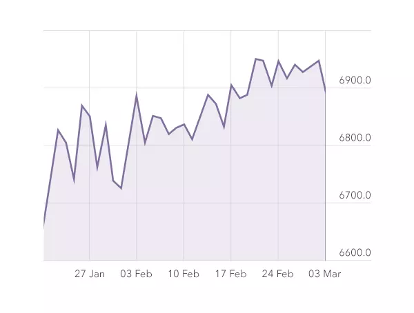
Unlike their bar and candlestick cousins, line charts only display the closing price of an asset over time. So if we look at the daily chart for spot gold, for example, each data point represents the closing price for gold on that day.
The benefit of using line charts is that they can make patterns easier to spot. However, due to their simplicity, you can miss some of the important price movements that occur between the open and close of each data point.
Bar chart (also called HLOC chart)
More complex than line charts, bar charts show the opening and closing prices as well as the highs and lows for each period. That's why they are sometimes called HLOC charts, because they display the High, Low, Open and Close.
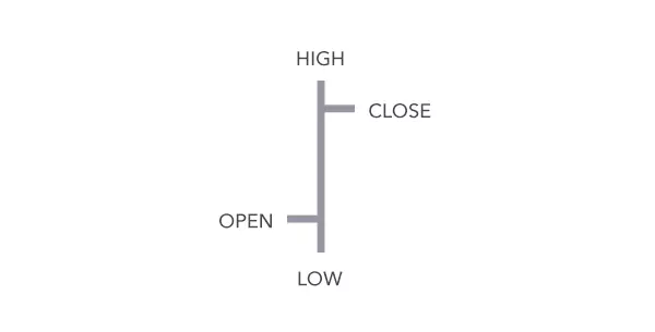
The very top of each bar represents the highest price traded during that period, while the bottom signifies the lowest. The horizontal notch to the left is the opening price, and the notch to the right is the closing.
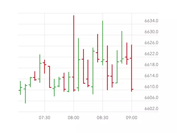
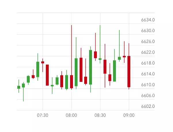
Often bar charts are in black and white, but they can also be displayed in colour, as shown on this five minute chart of the FTSE 100. In this case the red bars represent a five minute period where the price has dropped, while the green bars represent a five minute period where the price has risen.
Candlestick chart
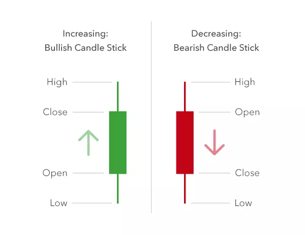
These show exactly the same data as bar charts, but represent the information slightly differently. Here the body of the candle signifies the open to close range, the wick is the high/low range, and the colour displays whether the price has gone up or down.
Traditionally, candlesticks charts were always shown in black and white, but most charting platforms now use red and green instead.
- A red (or black) body signifies a period in which the price has decreased
- A green (or white) body signifies a period in which the price has increased
Candlesticks are generally the most popular type of chart with traders, as they are able to convey a large amount of data quickly, in a visually pleasing and easily-digestible format. Certain patterns also tend to be easier to spot on a candlestick chart compared to a line or bar chart. Looking at that same five-minute FTSE chart, it's arguably easier to distinguish the market movements and trends on the candlestick chart than on the bar chart.
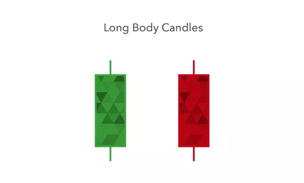
The shape of each candlestick can also give you clues as to the balance between buying and selling pressure in the market. For example, if a candlestick has a long green body, it shows there's a lot of buying pressure. If it has a long red body, there's considerable selling pressure.
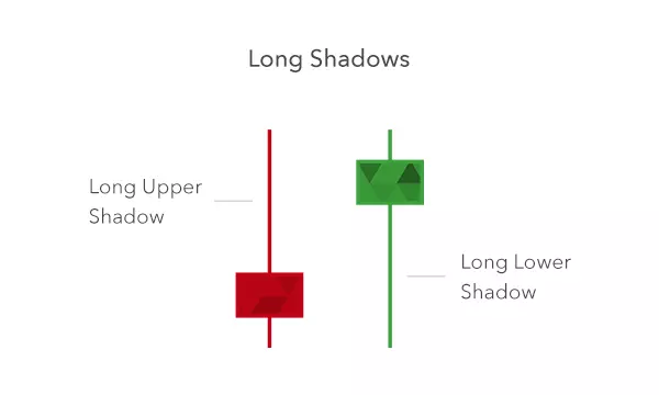
Candlesticks with short bodies and long wicks indicate that there was considerable pressure in one direction, but for some reason the price was pushed back before the end of that period.
We'll look in more detail at candlestick patterns later in this course.
Lesson summary
- There are three main types of chart: line, bar and candlestick
- Line charts just display the closing price of an asset over time
- Bar, or HLOC, charts show the high, low, open and close prices for each period
- For candlestick charts, the body of the candle signifies the range between the open and close, the wick is the high/low range, and the colour displays whether the price has gone up or down
- A green (or white) body shows the price has increased while a red (or black) body shows it has dropped
- Long candle bodies and short wicks signify there's been strong buying or selling pressure in one direction
- Short bodies and long wicks indicate there was significant buying or selling pressure in one direction, but that pressure then reversed
-
1
Introduction to technical analysis
3 min -
2
Types of charts
6 min -
3
Support and resistance
4 min -
4
Breakouts and fakeouts
4 min -
5
Trends and channels
4 min -
6
Basic chart patterns: part one
5 min -
7
Basic chart patterns: part two
6 min -
8
Candlestick patterns
7 min -
9
Moving averages
5 min -
10
Using moving averages
6 min -
11
Choosing your analysis tools
5 min -
Quiz
10 questions
The risks of loss from investing in CFDs can be substantial and the value of your investments may fluctuate. 69% of retail client accounts lose money when trading CFDs, with this investment provider. CFDs are complex instruments and come with a high risk of losing money rapidly due to leverage. You should consider whether you understand how this product works, and whether you can afford to take the high risk of losing your money.
CFD Accounts provided by IG International Limited. IG International Limited is licenced to conduct investment business and digital asset business by the Bermuda Monetary Authority.
IG provides an execution-only service. The information in this site does not contain (and should not be construed as containing) investment advice or an investment recommendation, or an offer of or solicitation for transaction in any financial instrument. IG accepts no responsibility for any use that may be made of these comments and for any consequences that result.
The information on this site is not directed at residents of the United States and is not intended for distribution to, or use by, any person in any country or jurisdiction where such distribution or use would be contrary to local law or regulation.
IG International Limited is part of the IG Group and its ultimate parent company is IG Group Holdings Plc. IG International Limited receives services from other members of the IG Group including IG Markets Limited.
©2003-2026